THIS SHOULD BE OBVIOUS THROUGHOUT THE POST BUT THIS IS NOT INVESTMENT ADVICE. PLEASE DO NOT FOLLOW THIS SYSTEM AS IT COULD RESULT IN SERIOUS LOSSES.
One of the perils of system-building is the tendency to unintentionally overoptimize by playing/refining the parameters to fit history. It starts with some harmless data playing but very possibly a system appears with some potential like that shown in More St. Louis Fred Fun with National Financial Conditions. Then through some form of iterative adjusting something seemingly magical occurs.
 |
| From TimelyPortfolio |
 |
| From TimelyPortfolio |
 |
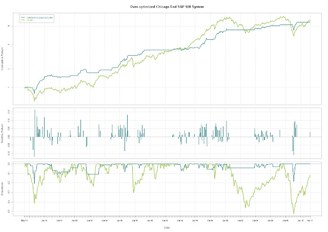
| From TimelyPortfolio |
However, after this subtle adjusting, I have no more data to test what might be something worthwhile, so I’m left with something to watch but not something on which I would risk my assets.
Play away but be careful. It is much better to start with an idea, test this idea with a limited dataset, and then extend the test to a much more encompassing out-of-sample dataset in terms of timeframes, other countries, or other asset classes.
R code:
#this bit of code will show a system after significant
#optimization and hindsight bias
#without any out-of-sample testing
#explore how SP500 behaves in different ranges of Financial Conditions
#see previous posts for more discussion
require(quantmod)
require(PerformanceAnalytics)
require(ggplot2)   #get data from St. Louis Federal Reserve (FRED)
getSymbols("SP500",src="FRED") #load SP500
getSymbols("ANFCI",src="FRED") #load Adjusted Chicago Financial
getSymbols("CFNAI",src="FRED") #load Chicago National Activity
#do not use this but here in case you want to play
getSymbols("PANDI",src="FRED") #load Chicago Fed Production and Income
#do a little manipulation to get the data lined up on weekly basis
SP500  <-  to.monthly(SP500)[,4]
ANFCI <- to.monthly(ANFCI)[,4]
CFNAI <- to.monthly(CFNAI)[,4]
PANDI <- to.monthly(PANDI)[,4]
index(SP500) <- as.Date(index(SP500))
index(ANFCI) <- as.Date(index(ANFCI))
index(CFNAI) <- as.Date(index(CFNAI))
index(PANDI) <- as.Date(index(PANDI))
SP500_ANFCI <- na.omit(merge(ROC(SP500,n=1,type="discrete"),
	ANFCI,CFNAI,PANDI))
#and just for fun an enhanced very basic system
signal <- runSum(-0.25*SP500_ANFCI[,2]-SP500_ANFCI[,3],n=4)
chartSeries(signal, name="Chicago Fed Signal")
signal <- lag(signal,k=1)
#go long if extremely negative (signal>10)
#or good but not too good (signal between -.25 and -2)
ret <- ifelse(signal>10 | (signal <= -0.25  & signal > -2.25) , 1, 0) * SP500_ANFCI[,1]
ret <- merge(ret, SP500_ANFCI[,1])
colnames(ret) <- c("ChicagoFed_LongOnlySystem","SP500")
charts.PerformanceSummary(ret, ylog=TRUE, main="Over-optimized Chicago Fed S&P 500 System",
	colorset=c("cadetblue","darkolivegreen3"))
#I really like the boxplot by range, so let's do the same here
df <- na.omit(merge(round(signal,0),ROC(SP500,n=1,type="discrete")))
df <- as.data.frame(cbind(index(df),
	coredata(df)))
colnames(df) <- c("date","ChiFedSignal","SP500return")
ggplot(df,aes(factor(ChiFedSignal),SP500return)) +
	geom_boxplot(aes(colour = factor(ChiFedSignal))) +
	opts(title="Box Plot of SP500 Monthly Change by Chicago Fed Signal")


