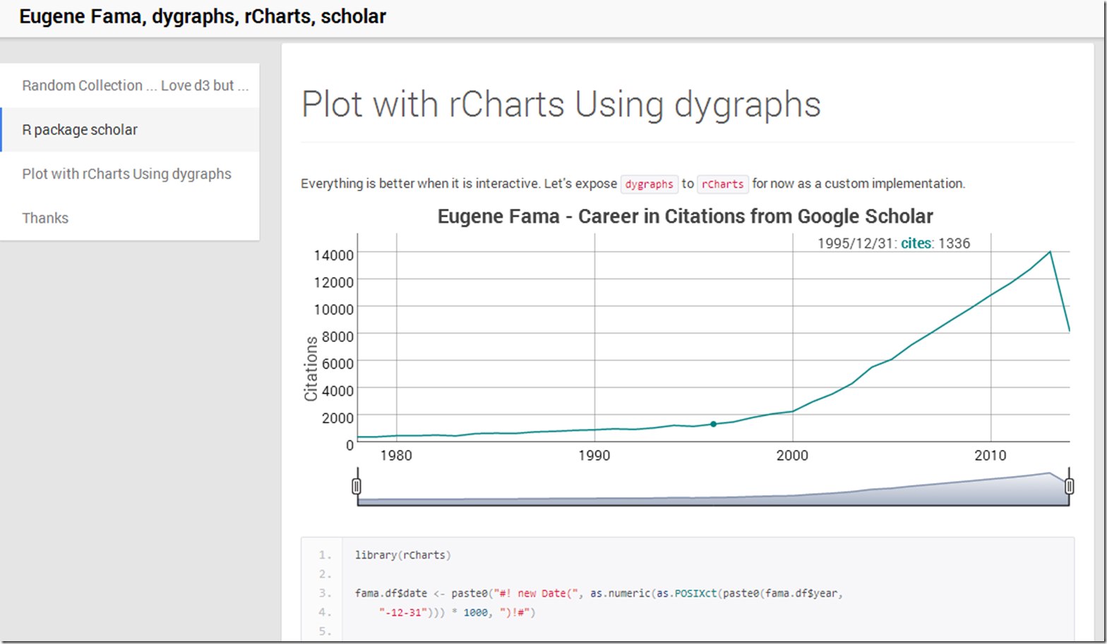
What better way to end the week than to dump a lot of random topics into some experiments. Here is what happened.
Friday, October 25, 2013
Equity Market Risk Premium Around the World
Over the years I have really enjoyed this very thorough IESE Business School survey of market risk premium around the world.
Market Risk Premium and Risk Free Rate Used for 51 Countries in 2013
A Survey with 6,237 AnswersFernandez, Pablo and Aguirreamalloa, Javier and Linares, Pablo
June 26, 2013
Available at SSRN: http://ssrn.com/abstract=91416
I thought a little d3/rCharts interactivity might really liven up the error bar plot. This is far from perfect, but I like the direction in which it is headed. Click here or on the screenshot below to see it live.
Thursday, October 24, 2013
ISO Popularity on Flickr Explore
Not finance, but I figured there might be some out there interested in the pictures from Flickr’s Explore. In addition to amazing photography, there is an abundance of information. In the short post below, I use R with rCharts, slidify, and Rflickr to take a look at the distribution of ISO speeds over the last 3 days' of pictures.
Wednesday, October 23, 2013
Overfitted Backtests
It has been a while since I discussed testing for overfitting in backtests. Since then, Marcos López de Prado and coauthors have done some very thoughtful work (see the bottom), and they even started a blog. Their newest paper builds on discoveries they made in their earlier work, and is an absolute must-read.
Bailey, David H. and Borwein, Jonathan M. and Lopez de Prado, Marcos and Zhu, Qiji Jim
Pseudo-Mathematics and Financial Charlatanism: The Effects of Backtest Overfitting on Out-of-Sample Performance (October 7, 2013)
Available at SSRN: http://ssrn.com/abstract=2308659
Translating scientific papers into code is not always easy, but I spent some time implementing some of the concepts in R, so that I can understand this more fully. Just as a word of encouragement to others out there, I am no math genius nor have any advanced math education, so please don’t be intimidated by formulas. Below you will see a slidify/rCharts discussion demonstrating these first steps. I plan to research this much more thoroughly. As always, I blog to interact, so please let me know what you are thinking.
Wednesday, October 9, 2013
Tuesday, October 8, 2013
R in Raw
This nice little tool Raw from DensityDesign transforms text from your clipboard to d3. For those yearning to access Raw from R, here is an easy way to do it.
Use this function read.excel from StatisticallySignificant’s post Copying Data from Excel to R and Back. Once you run the function, your data will be copied tab-delimited to the clipboard. Then simply paste the data into Raw and make some d3 charts.
rCharts goes Polar
The new micropolar library from Chris Viau, author of
gives us reusable charts with polar coordinates for d3.js. In testament to rCharts design, Ramnath Vaidyanathan integrated micropolar with rCharts in less than 30 minutes. I don’t use polar coordinates much, so I wrote this quick little comparison of Cartesian and Polar systems using simulated money manager returns to get me up to speed.
Friday, October 4, 2013
Simplicity Explained by The Author
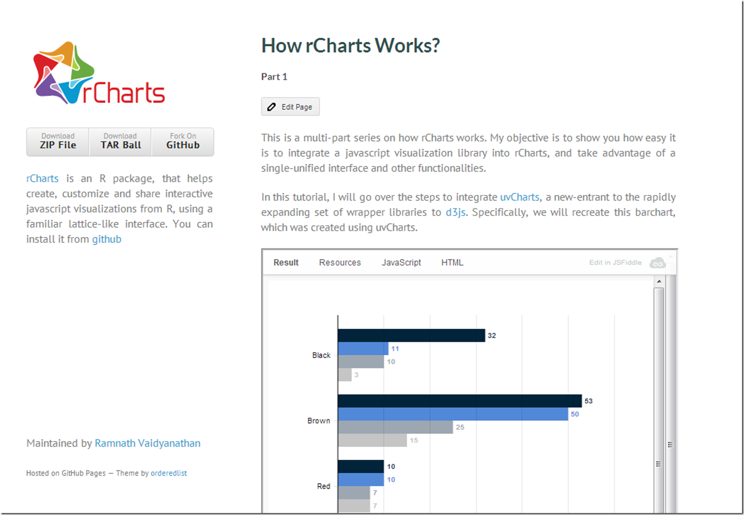
Source is usually best explained by the source. Ramnath Vaidyanathan provides an excellent look under the hood in his tutorial on rCharts explaining how he integrates the new d3 library uvCharts.
If you want to explore further, here is a list of my posts on using custom d3 with rCharts: rCharts Remake of NYT, Exploring Networks with Sankey, rCharts version of d3 horizon, d3 <- R with rCharts and slidify. I hope you are inspired to add your own rCharts implementation.


